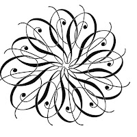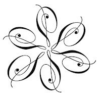

The top 2 images are my variations. I did one that said glow and the other is distortion. That is my favorite. I added some color on a grayscale to that. The bottom two images are my steps to getting there.
HERE'S OUR ONLINE CLASSROOM FOR 2-D DESIGN CLASS, MOD 2, 2009, ALBERTUS MAGNUS COLLEGE. POST THE BEST EXAMPLES OF YOUR WORK, WITH A DESCRIPTION AND INTERACT WITH YOUR CLASSMATES BY COMMENTING ON THEIR WORK.
Okay Pam... you have the idea working well... they would be tighter if the centers lined up as if they were touching a circle in the middle.
ReplyDeleteAlso watch how the unit as a whole exists in the frame... you could crop it to make a circle in a square with equal borders.
The second shot has a Picasso-"esque" feel to it. Nice job.
ReplyDeleteI really like your use of the greyscale coloring, especially the second one - it looks as if the piece is moving.
ReplyDelete